
Pains:
User spends too much time searching the internet for the best offer and it is overwhelming.
Duplicate entries make them board.
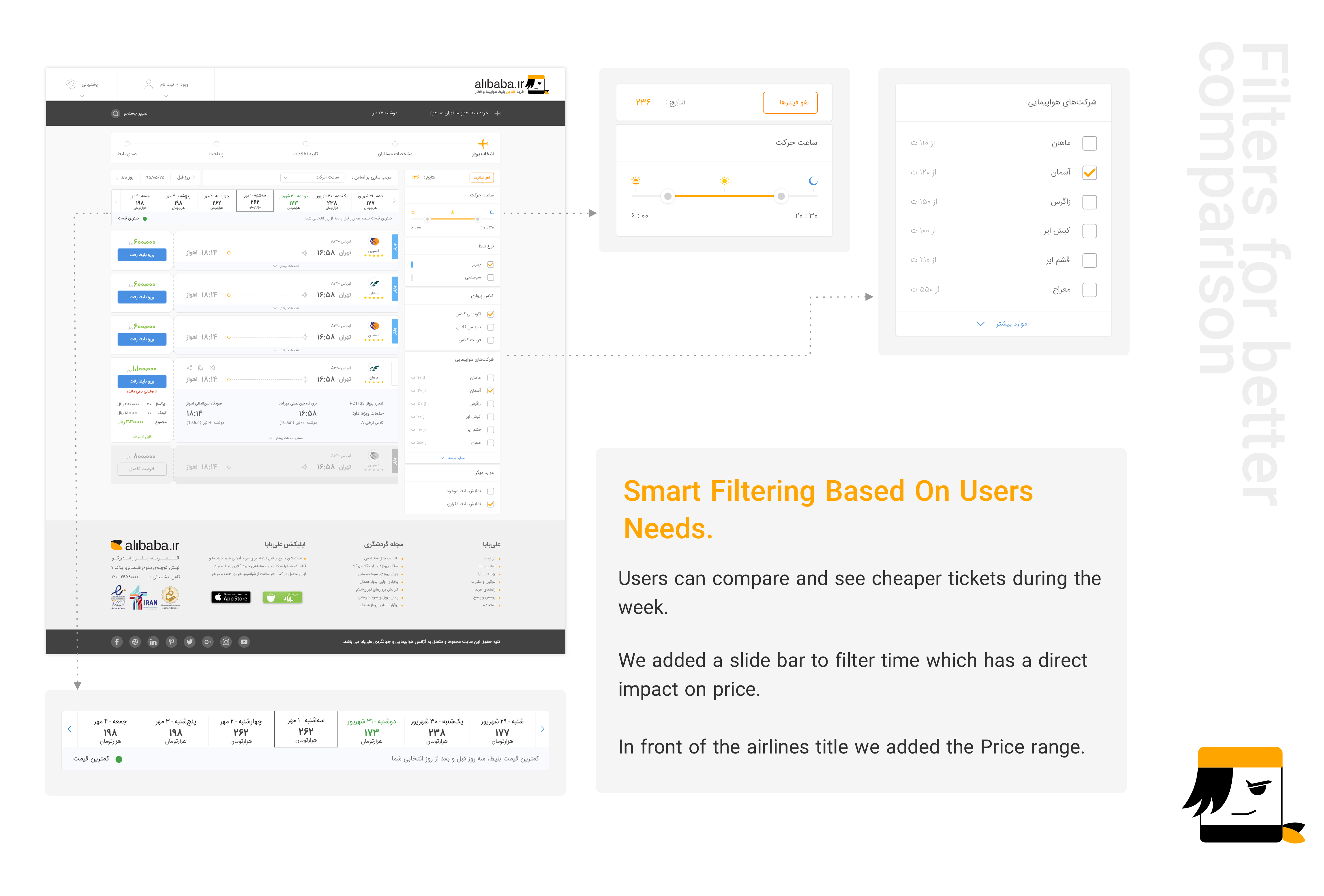
User need to compare prices between different airlines to find the best price.
Filtering the time is very important for them.
Gains:
Traveling with people and hang out with a group is always fun and exciting and gives you new experience.
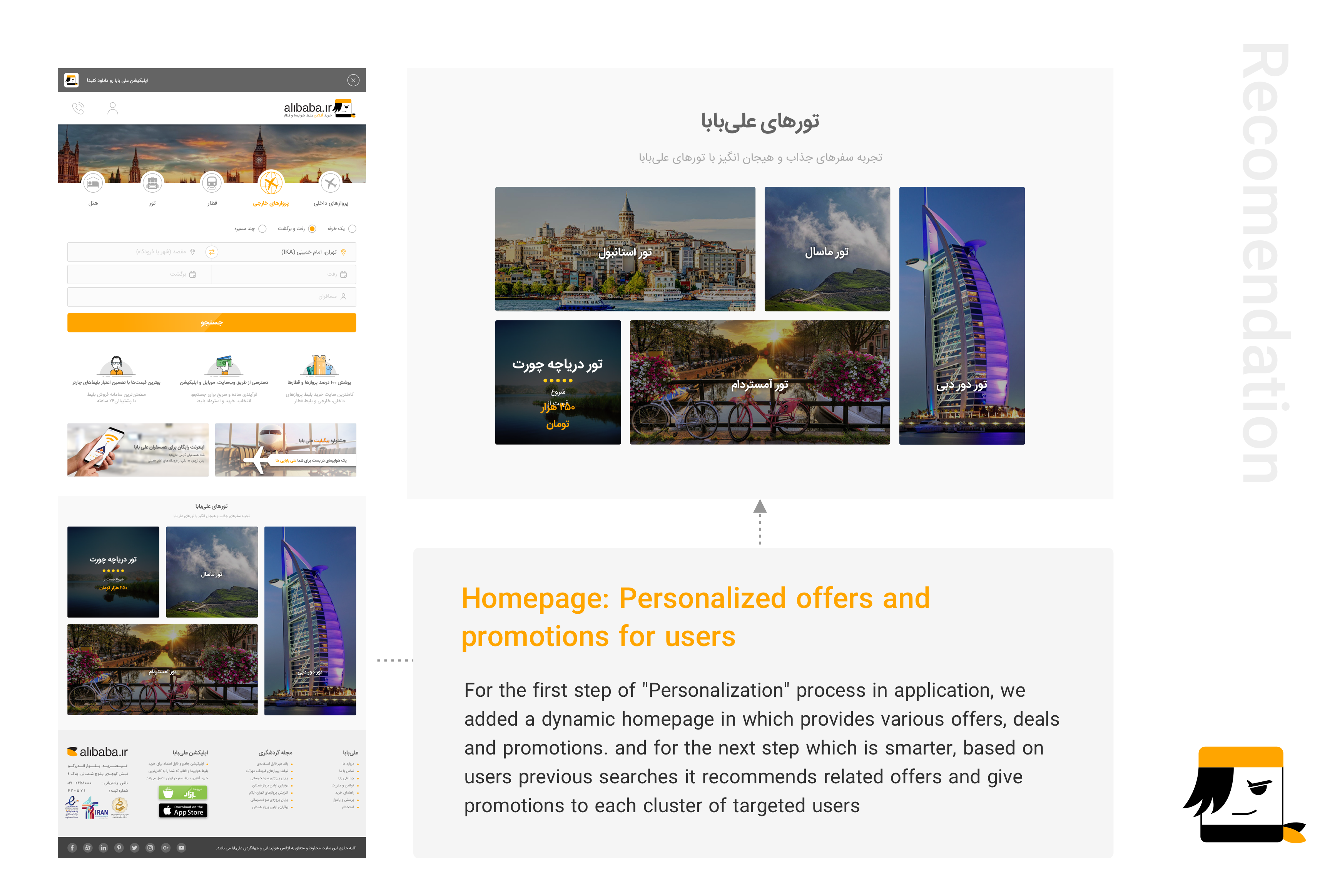
Offers and deals based on user's taste could save him so much time and engage the user more.
With a loyalty discount user feels that each ticket he buys is valuable for the future purchases.
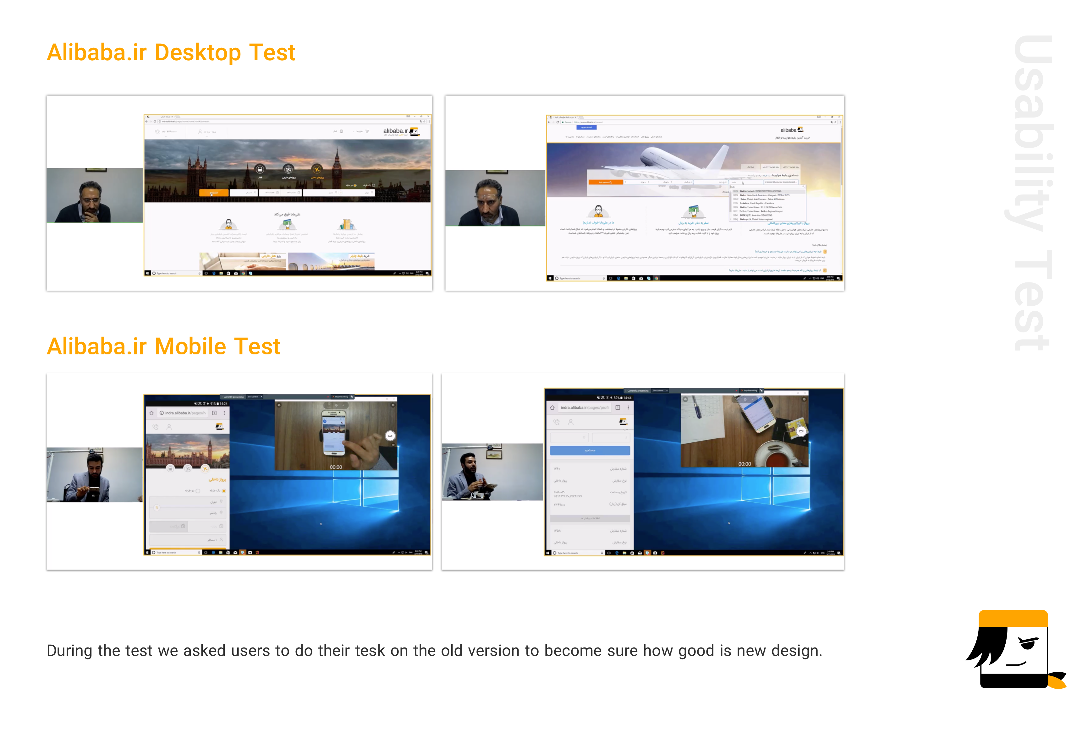
When the UI design phase was finished we conducted a usability test whose owner was me!
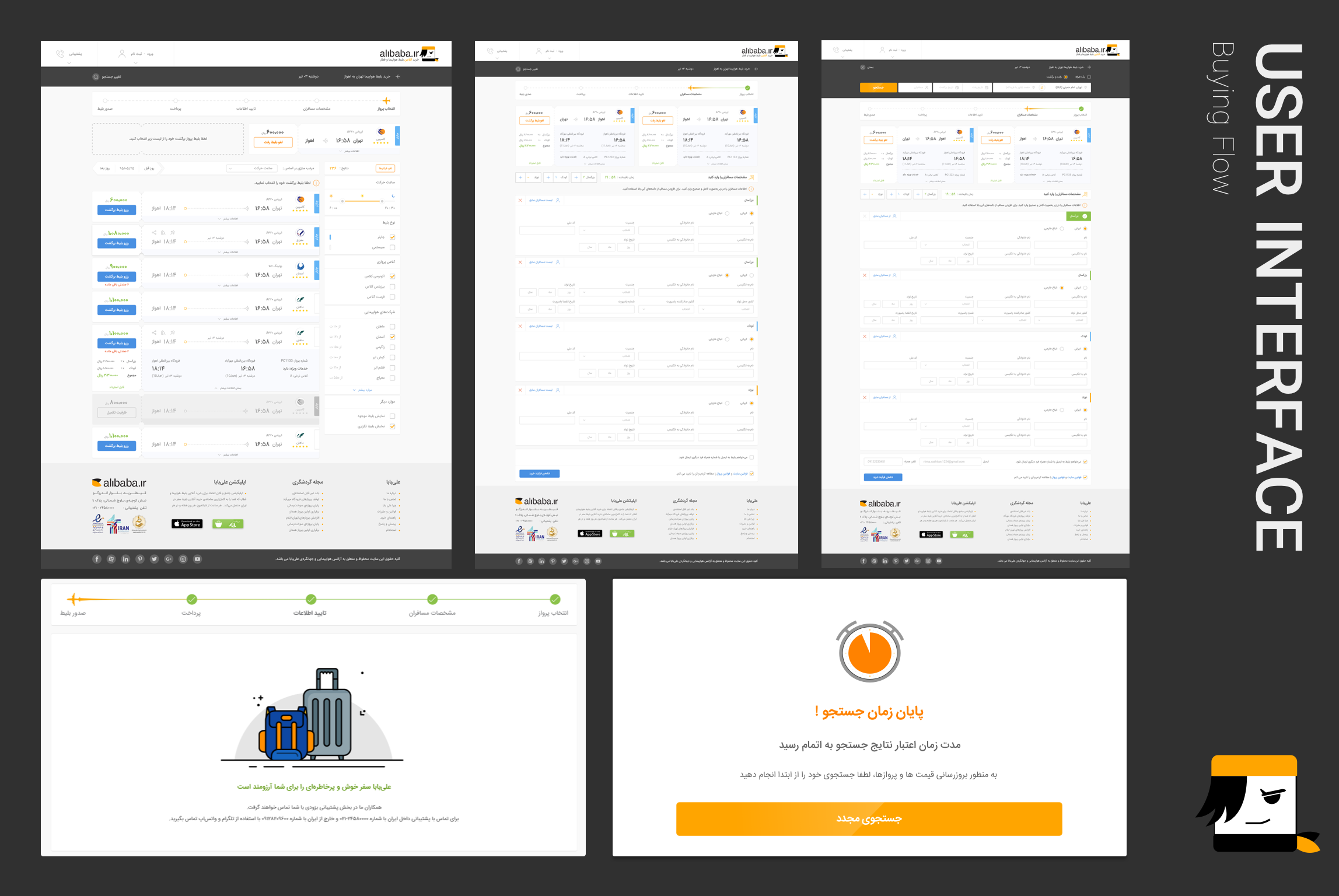
We categorized the most significant flow of Alibaba.ir into blow list because most of the processes in all services are similar. Additionally, We evaluated domestic flights since the it has the most revenue for the company.
Search
Listing
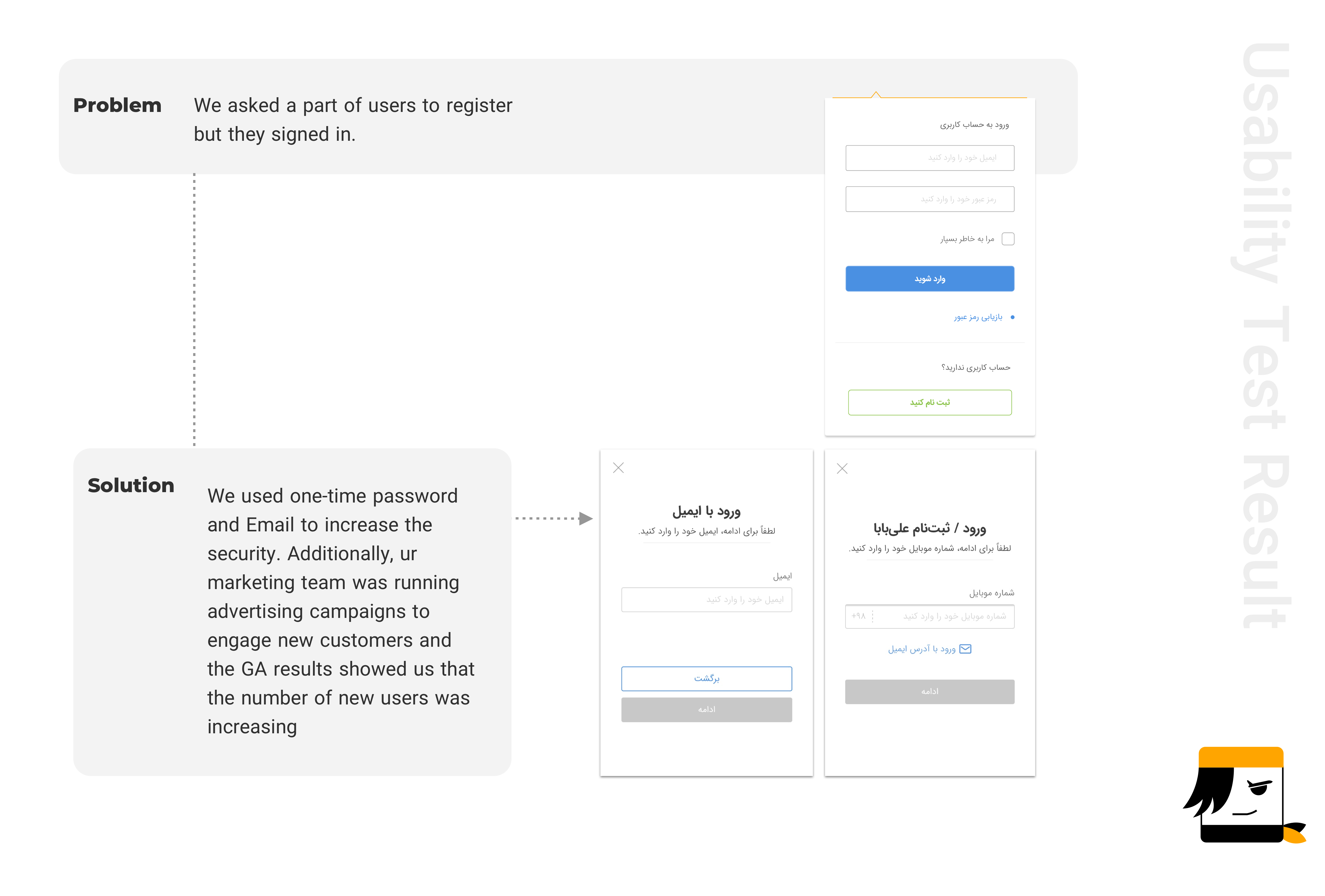
Registration
Details of Form
Payment
Refund
You can see one the of mobile tests through this link
You can see one the of desktop tests through this link
Problem: When users use back, their entries is not saved.
Solutions: We fixed it by helping development team.
Problem: Users tend to click on the whole inputs but just icons are clickable.
Solutions: We fixed it by helping development team.
Problem: Users have to type whole letters of a city name to choose it in search box.
Solutions: We fixed it by helping development team.
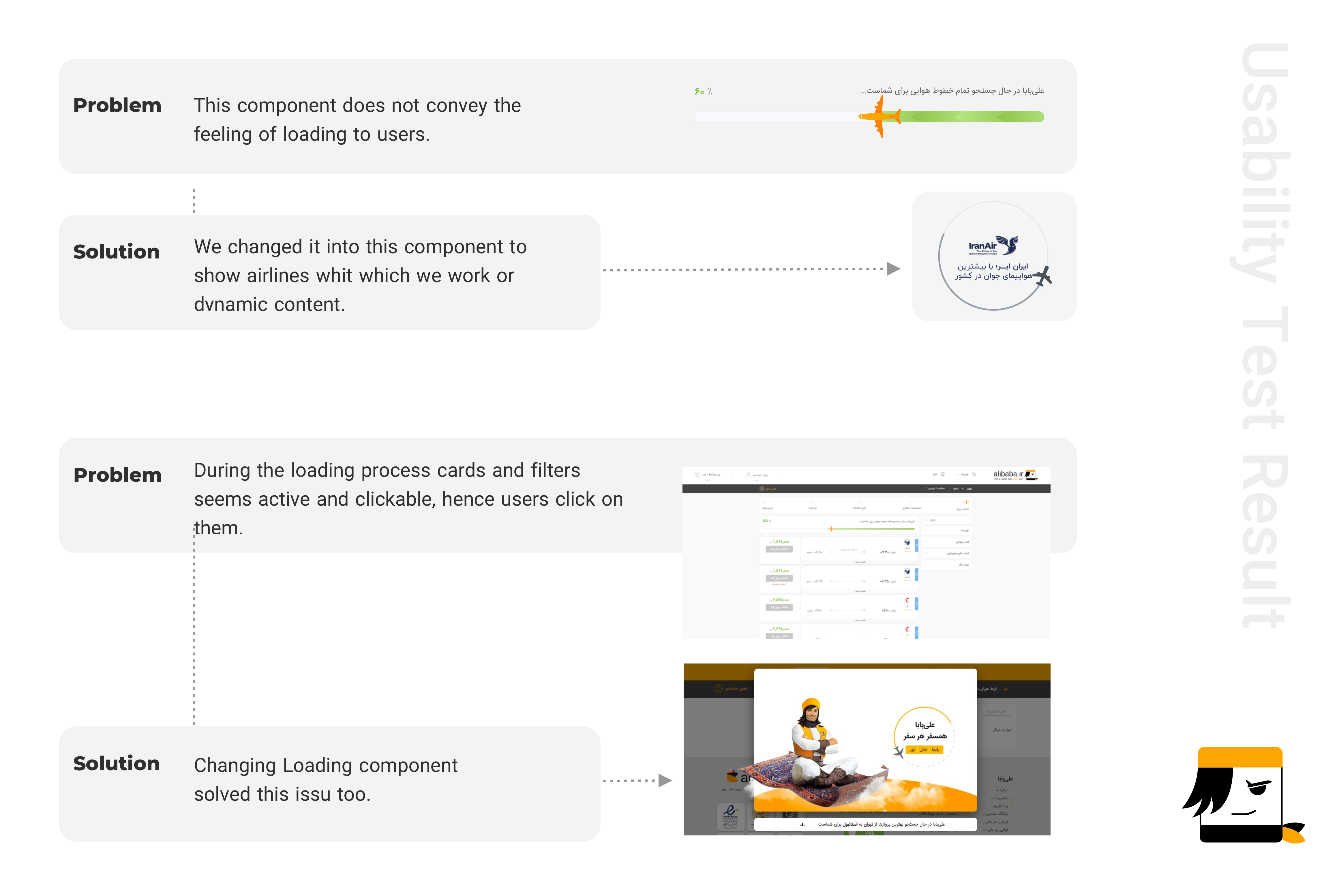
Problem: When users are scrolling the listing page, filters are scrolling too.
Solutions: We fixed it by helping development team.
Problem: During completing the details of information, users can not remove a member.
Solutions: We added remove function to each card.
Problem: Adding from passenger list is not as clear as could be.
Solutions: It was an outline component, so we changed it to a fill button.
Problem: Based on input (Persian or English) they had to change keyboard.
Solutions: We fixed it by helping development team.
Problem: Refund is not clear. 70 percent of users didn't find it.
Solutions: In their profile we changed the ticket place.
The goal of this project was improving its user interface in accordance with new trends, reducing the number of calls in customers support department, however during this process by using UX tools and design thinking method we improved its usability. All this process helped us create a meaningful product for our users, which resolves pains during the travel experience and helps them to achieve their goals. As a team, we realized the importance of developing a product with a user centered approach. We also learned the power of testing ideas in the first stages of the process, to validate our product before the development. Today I am pleased to say I launched UX laboratory in Alibaba company which is stile alive in the process of design in this team. On the other hand, I realized the role of user interface in in improving a usable product.
If you like what you see and want to work together, get in touch!
Zohreasgari0@gmail.com