.png)
Based on my research I gathered these problems:
1: Microcopies are not clear
2: extra features are provided
3: long forms for sending a request
4: product seems complicated for its users whose tech knowledge is not advanced.
5: When uses save a file, they don't know how to find it.
I shared the result of the test with our stakeholders, and they had some concerns about redesigning the product. I Persuade them to remove some extra features.
We all agreed that these features are necessary for our users:
1: Sending a Catalog request.
2: Owner access.
3: Profile and our messages.
4: A specific place for files.
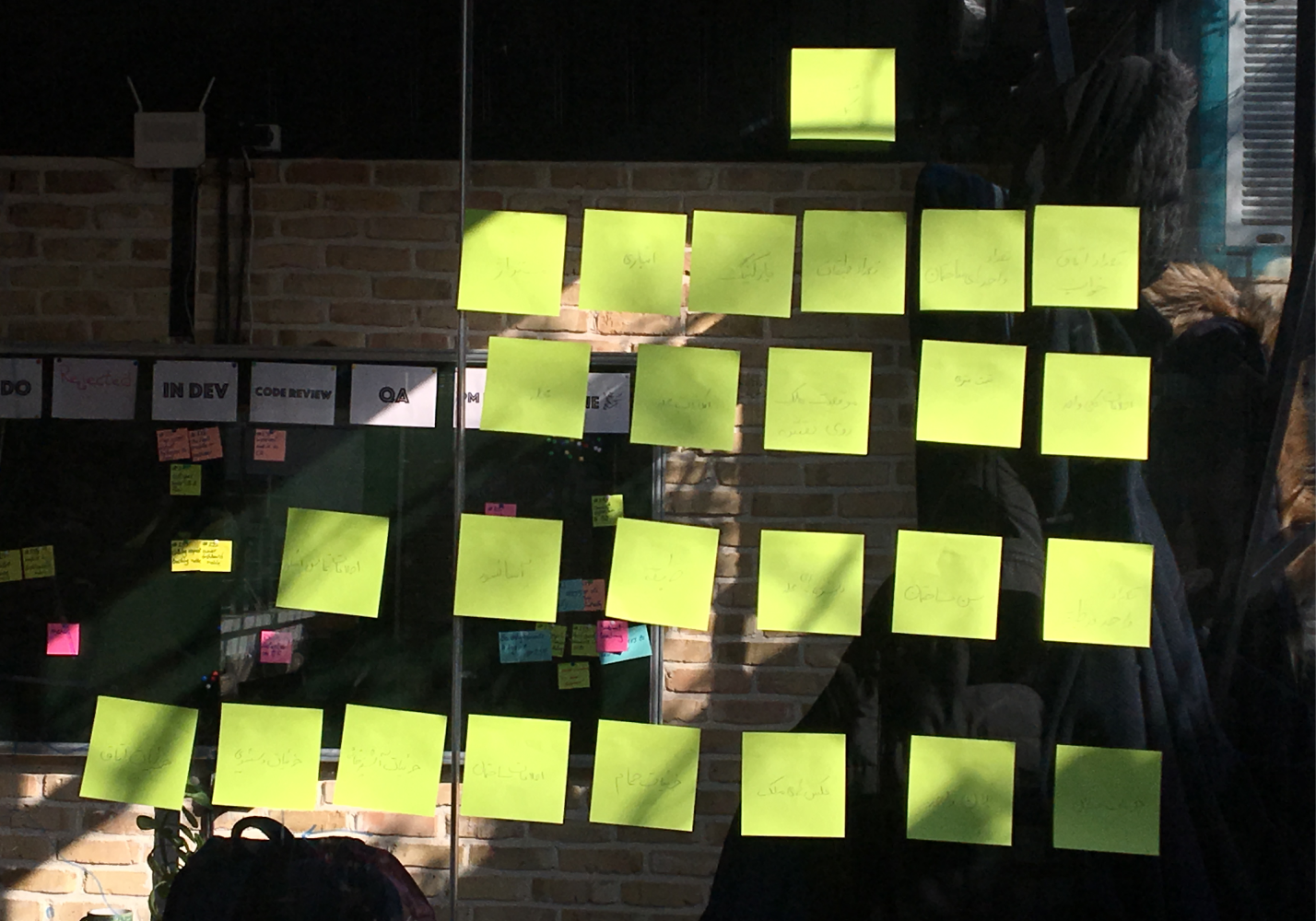
By using Crazy 8 Technique we shared our ideas,It helped us to don't miss any ideas
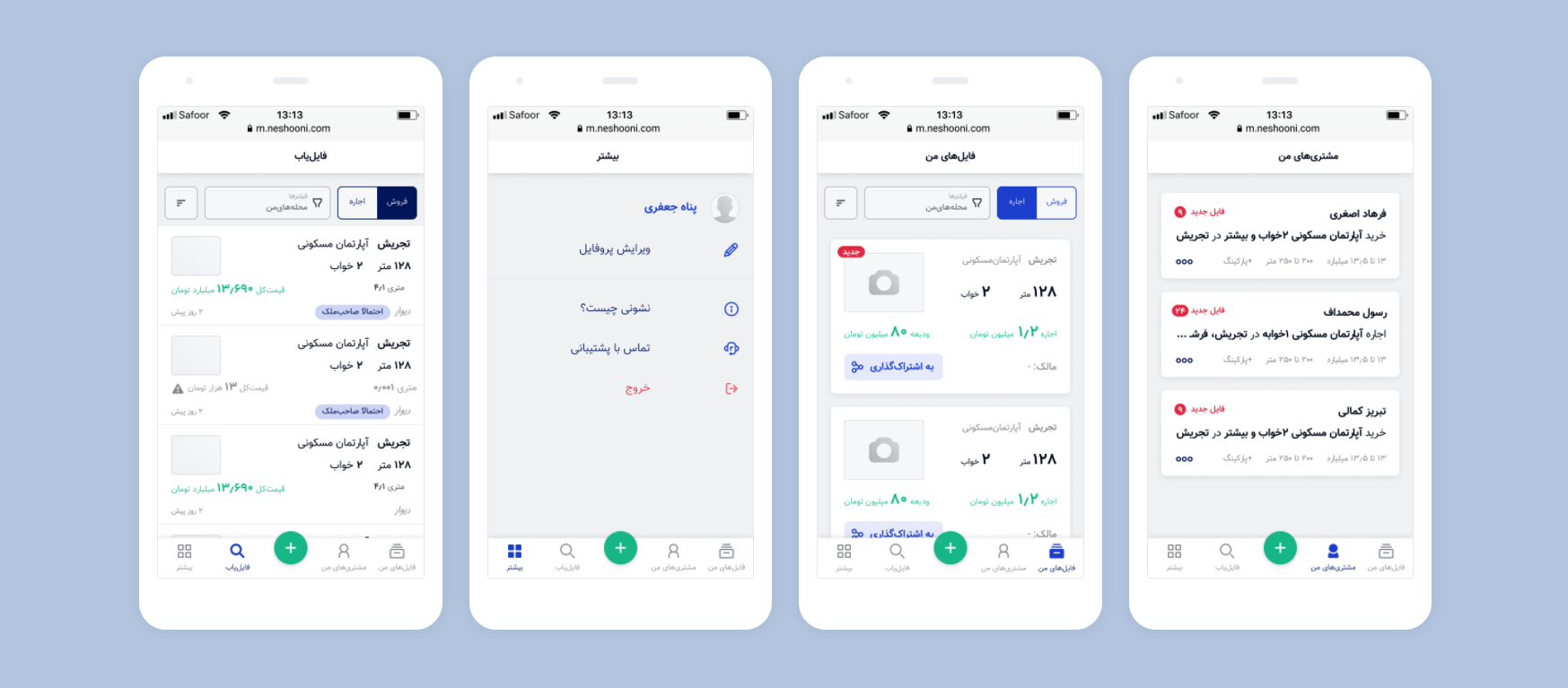
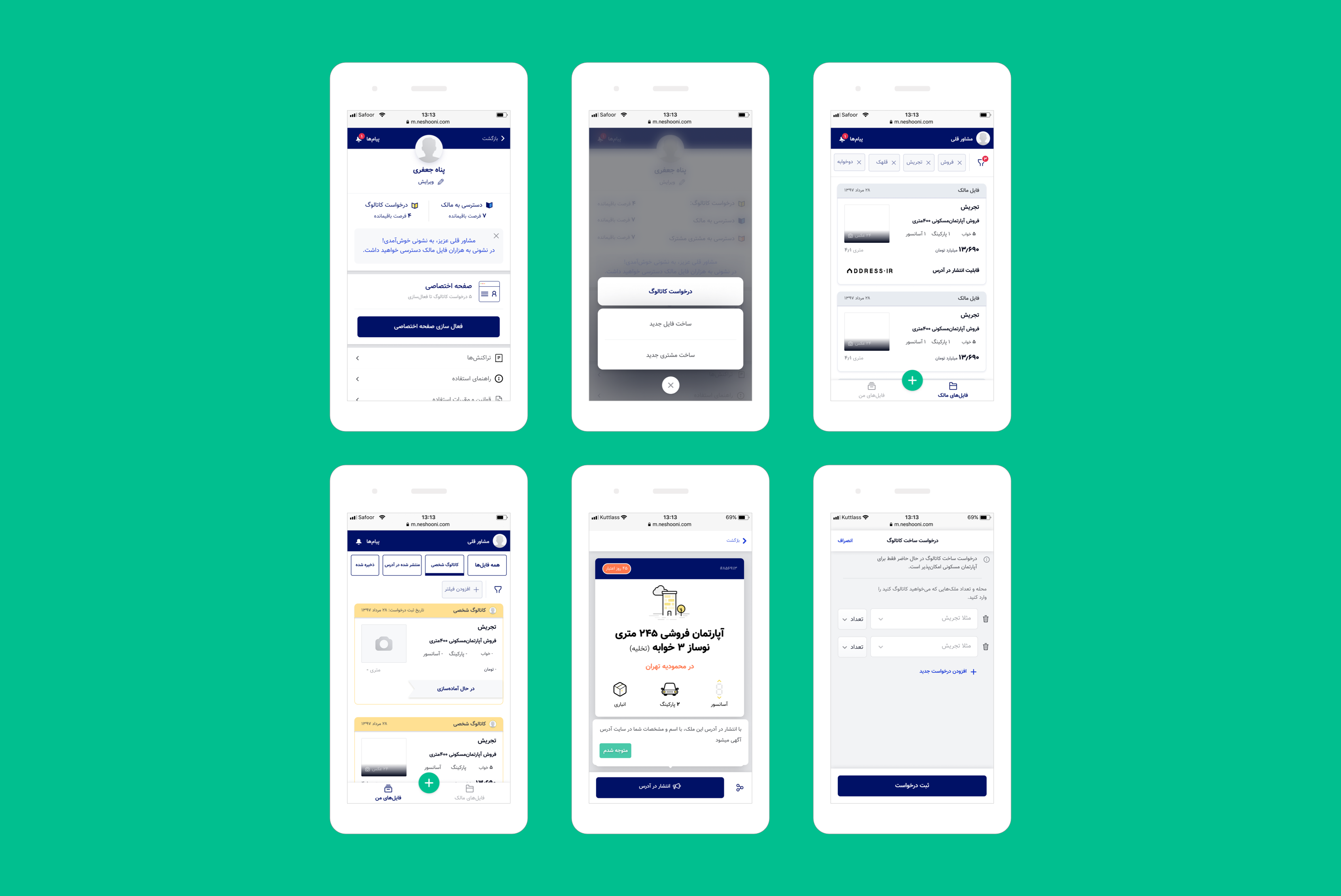
The most important thing in our new design was changing the navigation bar.we used to have bottom navigation for five destinations, but they were not useful, and based on our user's behaviors and our business need we change it to 3 destinations.
1: We added some new colors to show some differences between Files and Catalogs.
2: Adding tooltips
3: Having toast messages
4: Changing some microcopies
5: With new messages, we could communicate with our users better than before.
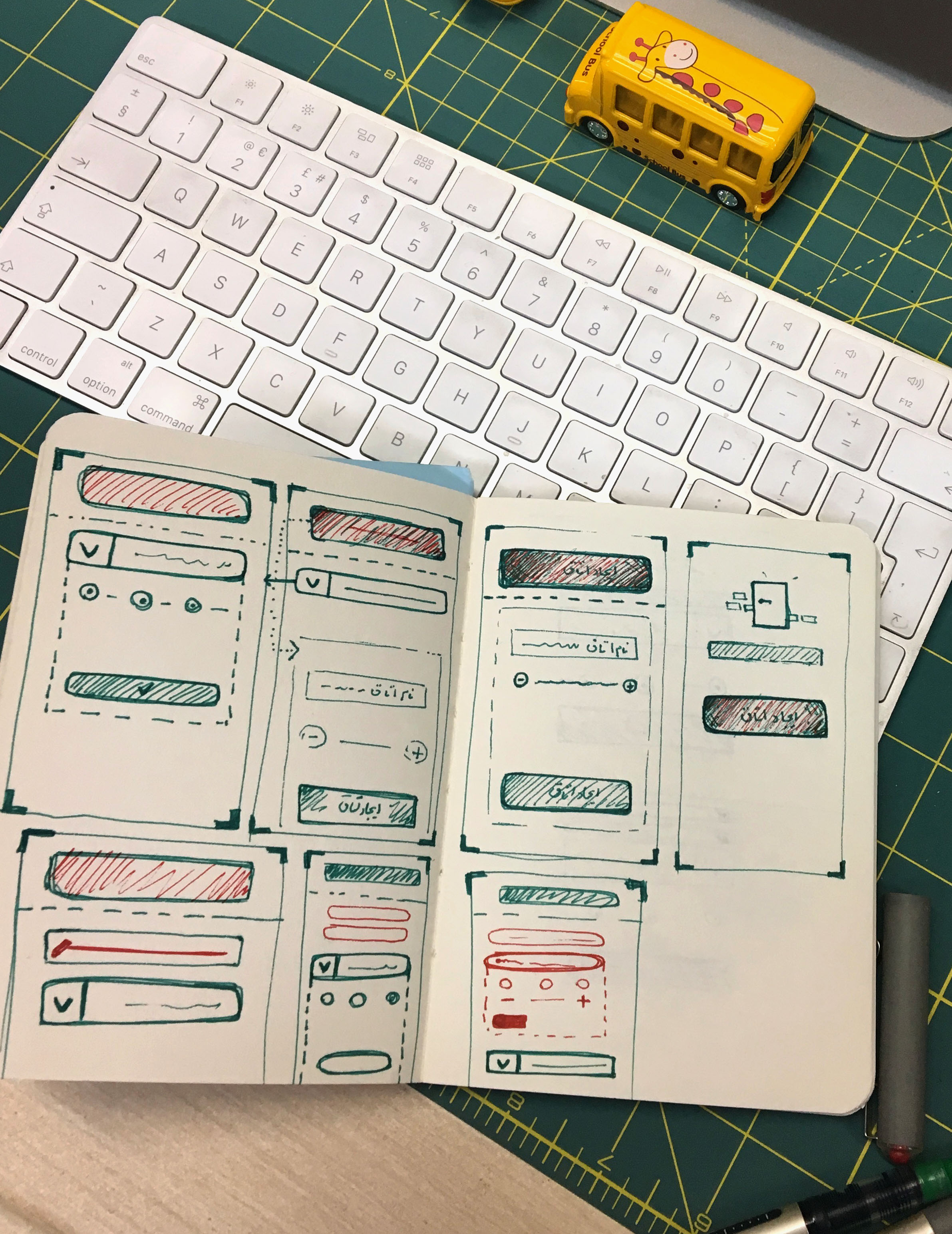
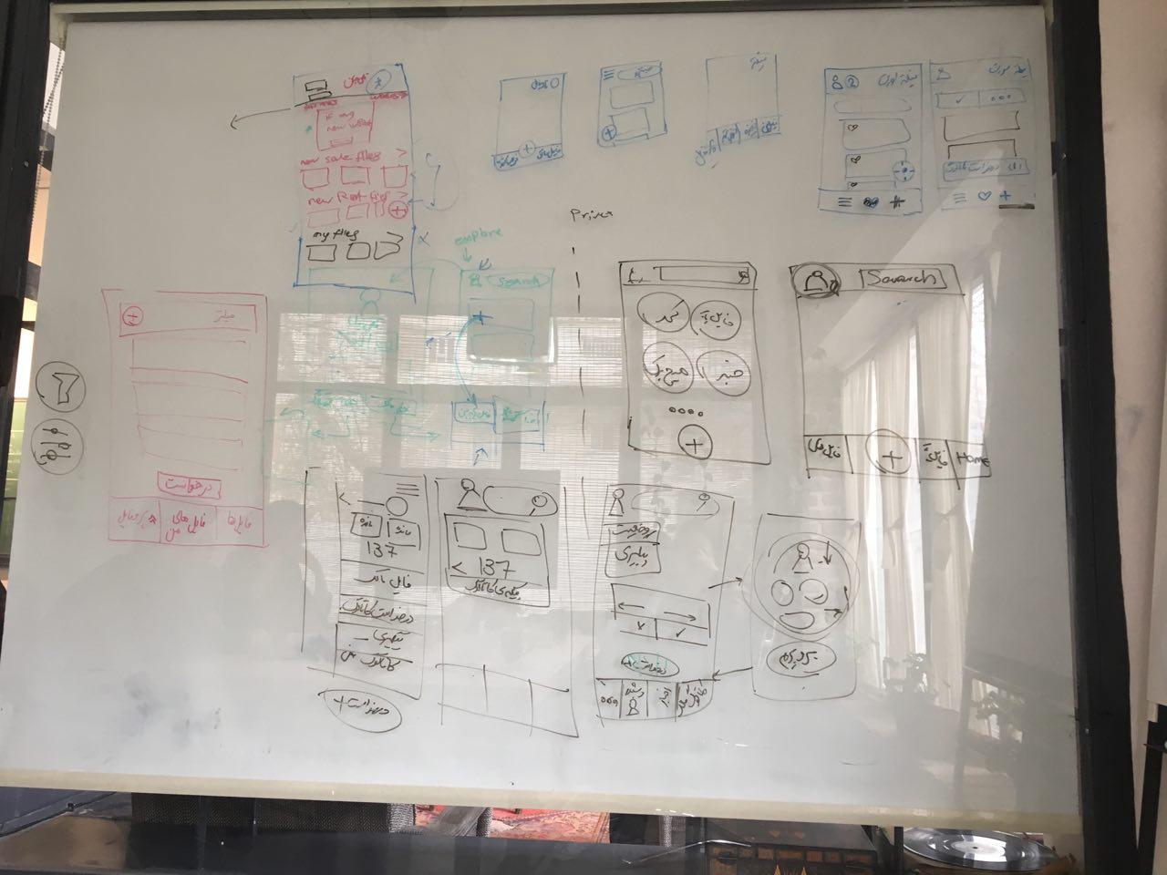
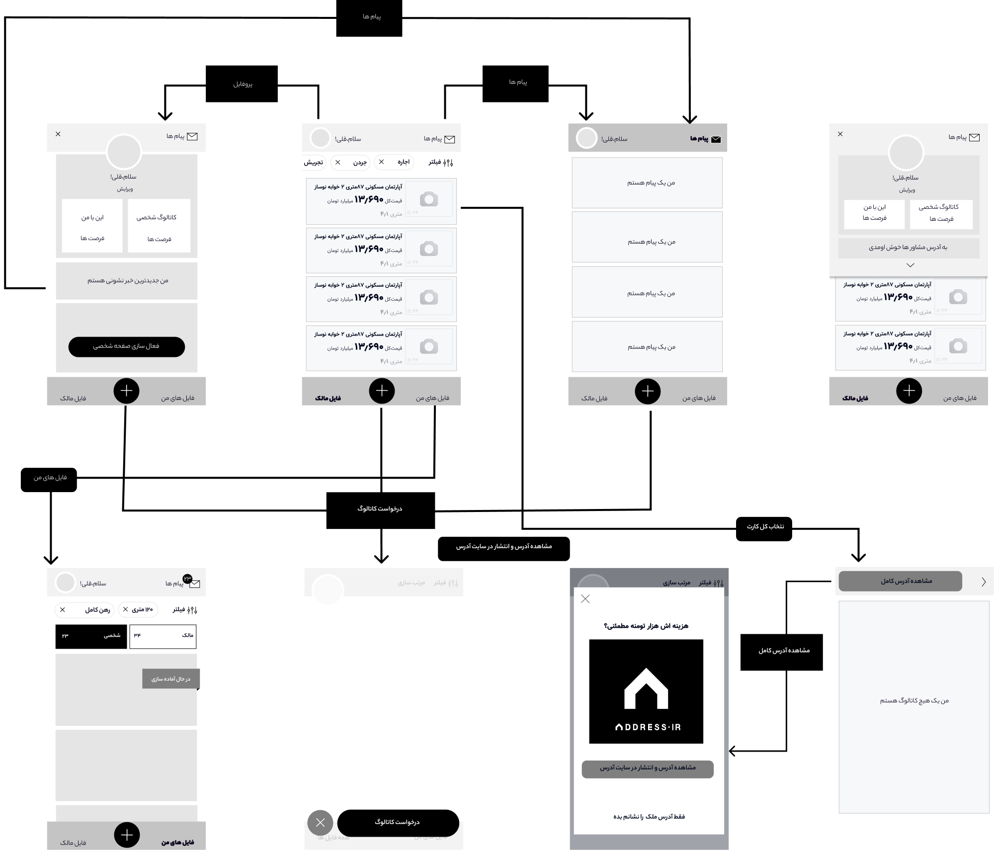
I usually start the design process with low fidelity sketches. This is the way I iterate through many design options quickly. In this case, we did not need to change UI elements, so we just focused on user flows, and we wanted to be more simple.
The idea behind a wireframe is to demonstrate to the client/stakeholder/user what elements will exist on the page and how those elements will interact with other areas of the Product.
It is incredibly important to get the structure and user journey, so a wireframe can help us achieve this at an early stage.
The interface design strives to be confident. It does not contain UI‐bling or unnecessary elements. We opted for clear, readable typography —choosing colors with high contrast to increase legibility in low‑light conditions. The design is clean, large and well spaced. All our design decisions help to exude a sense of confidence in the design
Usability testing Gender: Male:
Tasks:
1- Catalog request
2 -Owner access
3 -Changing profile preferences
ResultThey successfully did their tasks and it was obvious, however, they need to trust and our next task was to work on it.We evaluated the product by testing it on users.
What have I learned from this project?
As a Product designer in this project, I have learned to identify users better than before, and our design has to be interactive, we have to talk to users in our product like the real world and we should guide them. Extra features in a bad time do not help our users, and it is better to release our product step by step.if our users do not trust so, we need to coordinate with the rest of the company. Sometimes, some problems are not due to the product, if it is not possible to solve all problems through product, we have to solve it via other parts just by having a superb communication.
If you like what you see and want to work together, get in touch!
Zohreasgari0@gmail.com