
We had a great database of real estate consultants, so, we asked them to go in there agencies to observe their customers who were looking for houses.
During the observation, we realized what kind of features are more important for them and what requirements are not supported in the real world.
We set up an online survey and asked customers to fill it out. The questions were based on apartment features and amenities. 200 people filled the survey.
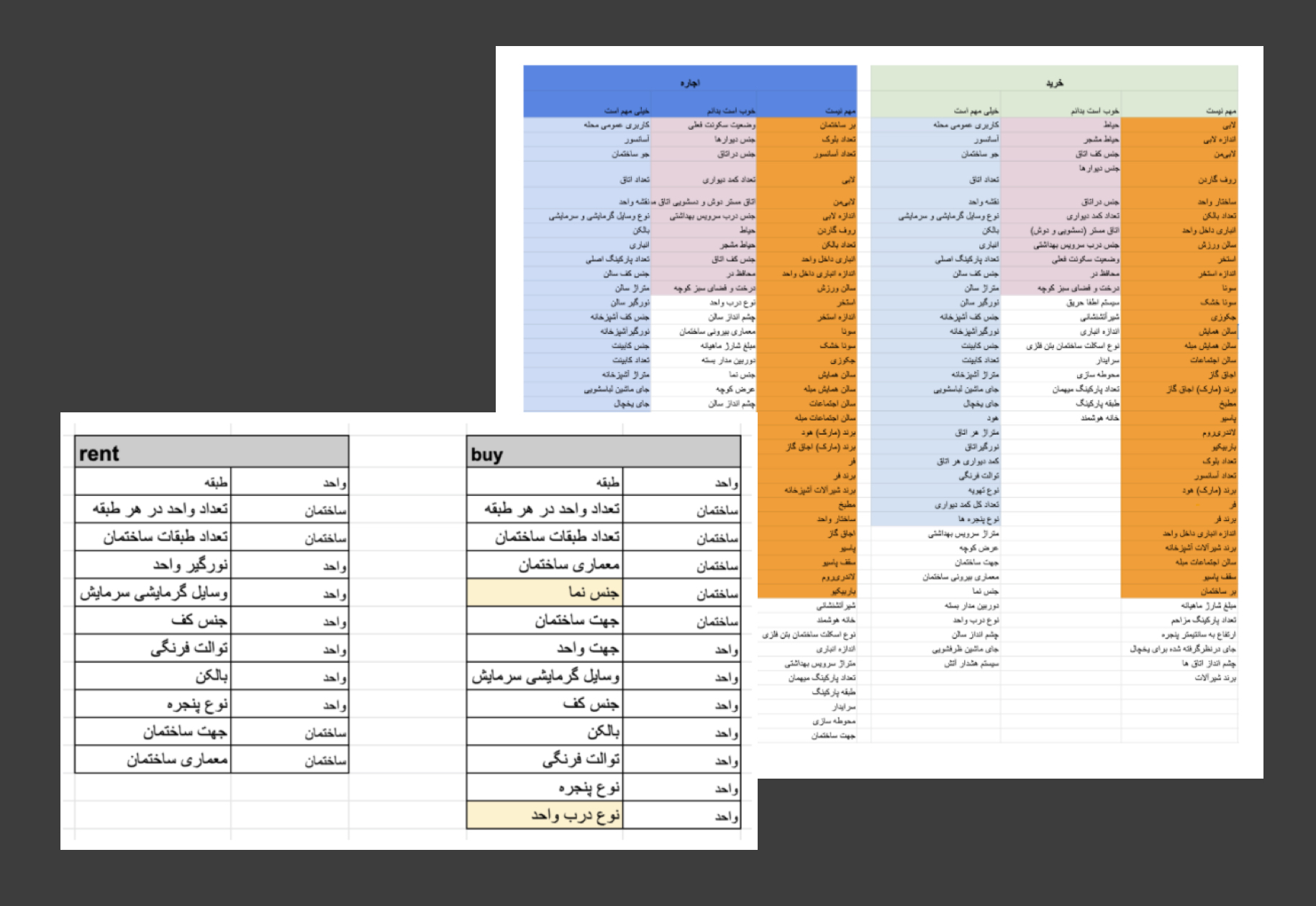
We need to review the hierarchy of information based on their needs. Buyers and renters needs are sometimes different. So, we have to have different information hierarchy for tenants and buyers.

To understand the users' expectations we used card sorting approach to build the best structure for our users.
When we had a lot of data we should use this method. I used moderated, paper, open card sorting method and did it in our office.
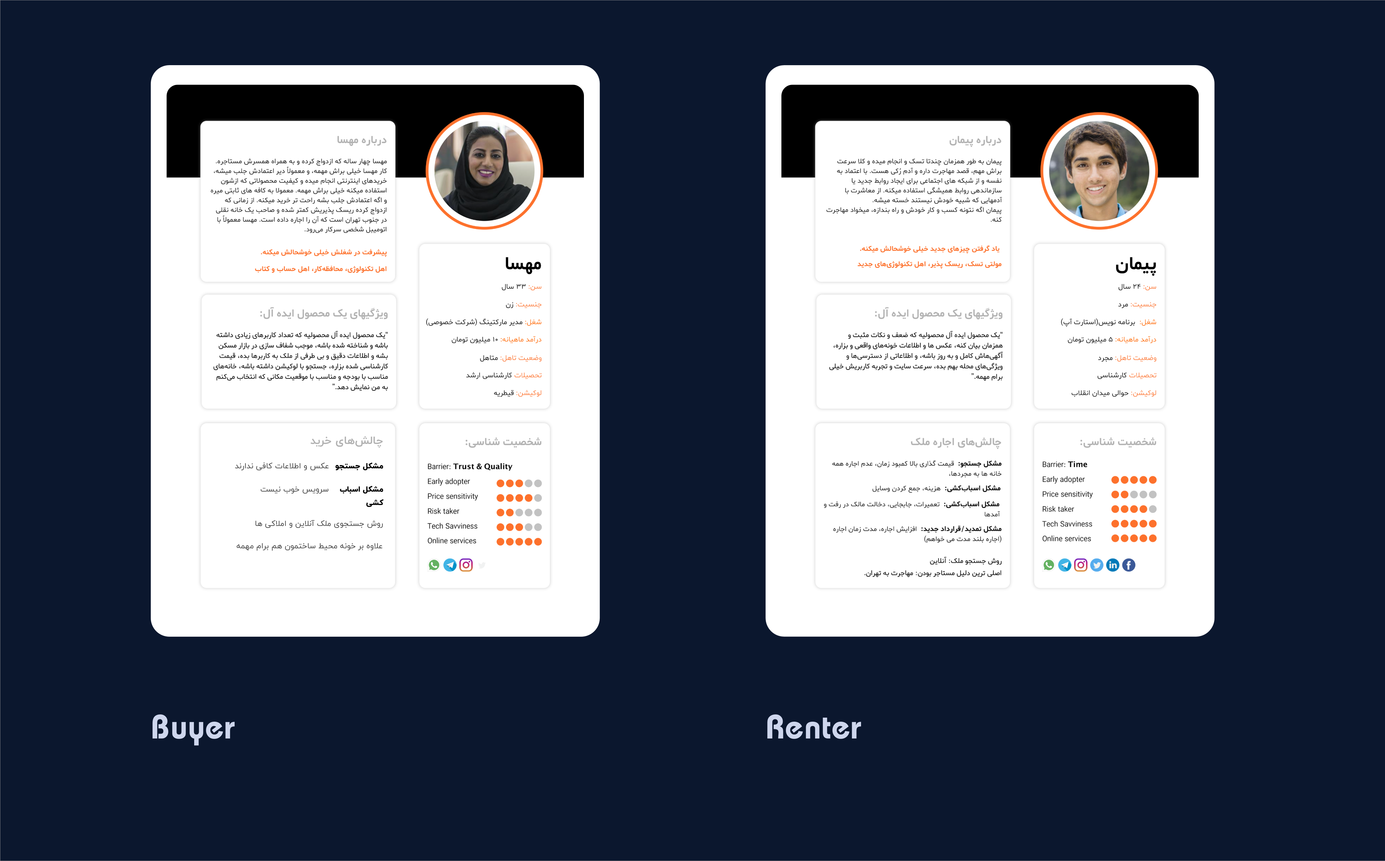
Based on the interviews/workshop we set up two personas. We referred to them throughout the entire product development process.
The objective of a goal-directed persona is to examine the process and workflow that our users would prefer to utilize in order to achieve their objectives in interacting with our product or service.
We use interviews and our stakeholders to create our personasOur user's needs were really different, so we needed to have personas for them.
we provided some information about each of the personas (demographics, problems, motivations, etc)
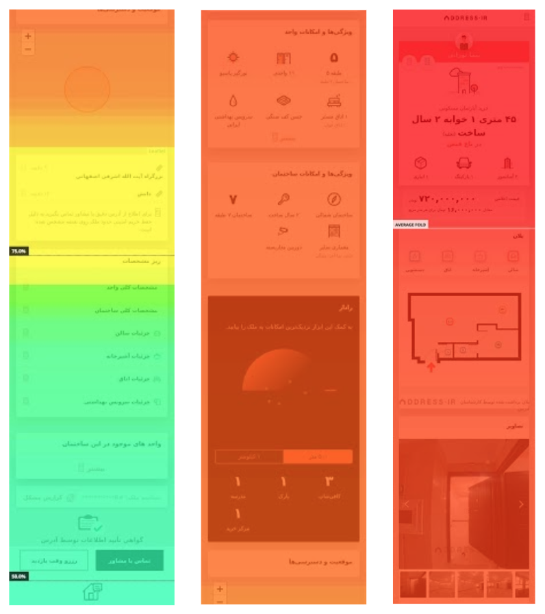
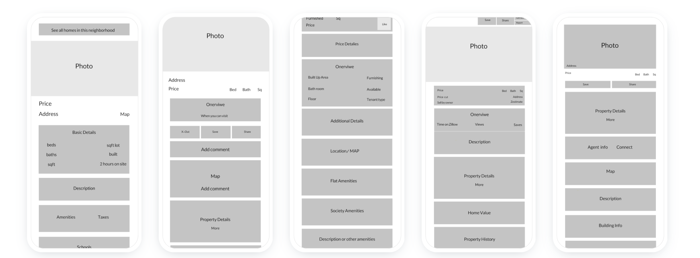
Homes Details page
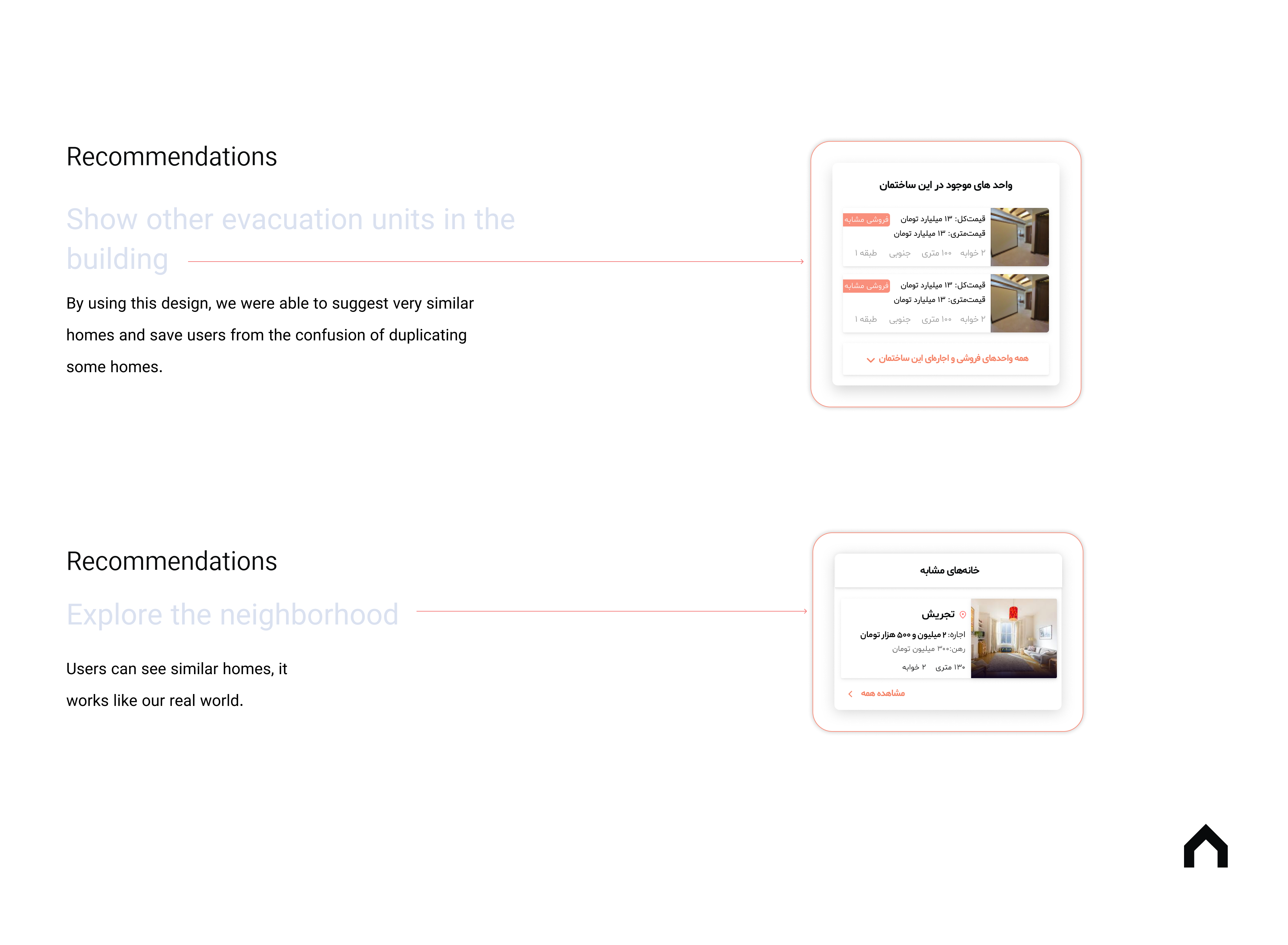
1: Tags. Tags are only on 13.33% (10/75) of homes because we wanted to keep these ‘for you’ tags as great as possibleUsers must click on 10 or more homes in order to receive these recommendations.
2: Similar homes: Additionally, I added a section within the app that only shows recommended homes. They can edit/add tags at a general level, which will influence and better their personalized results.
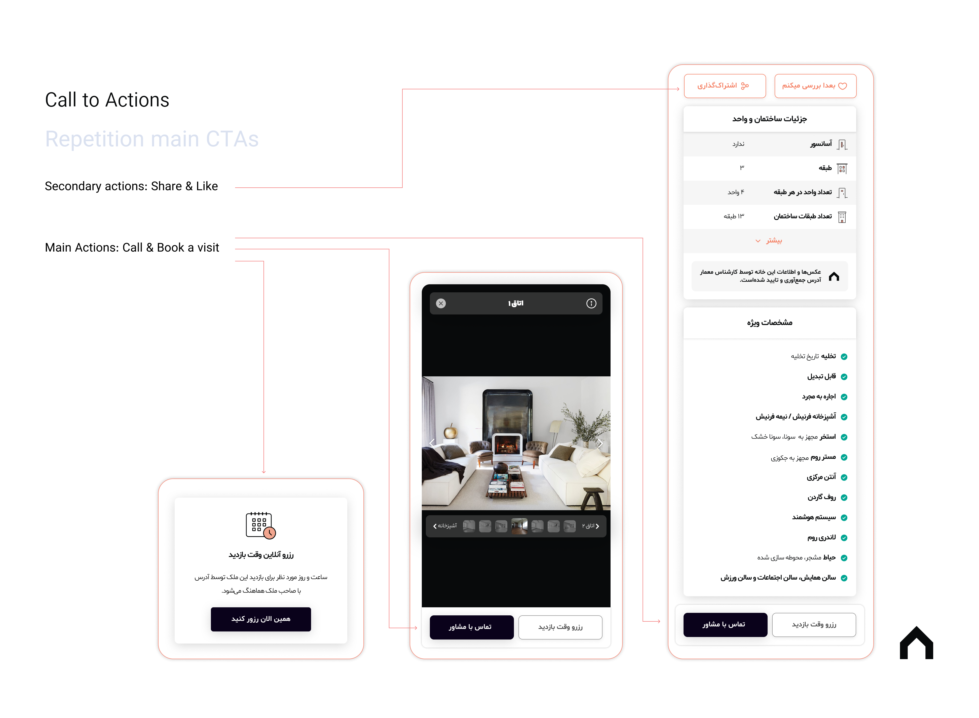
3: Repetition main CTAs when we think our users have been satisfied, added a call or book a visit button. For instance, all users see photo gallery, hence we added a CTA in this section.
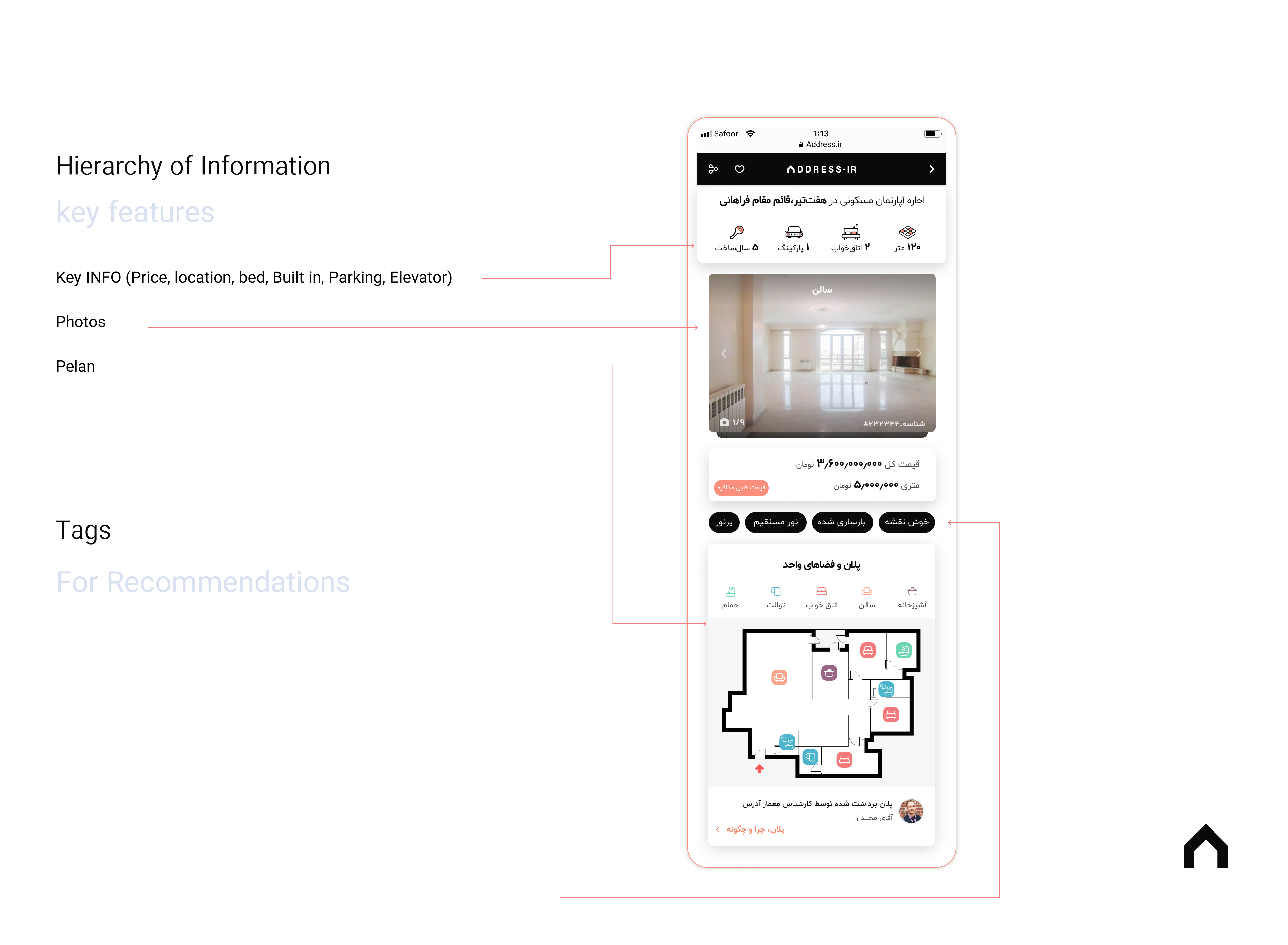
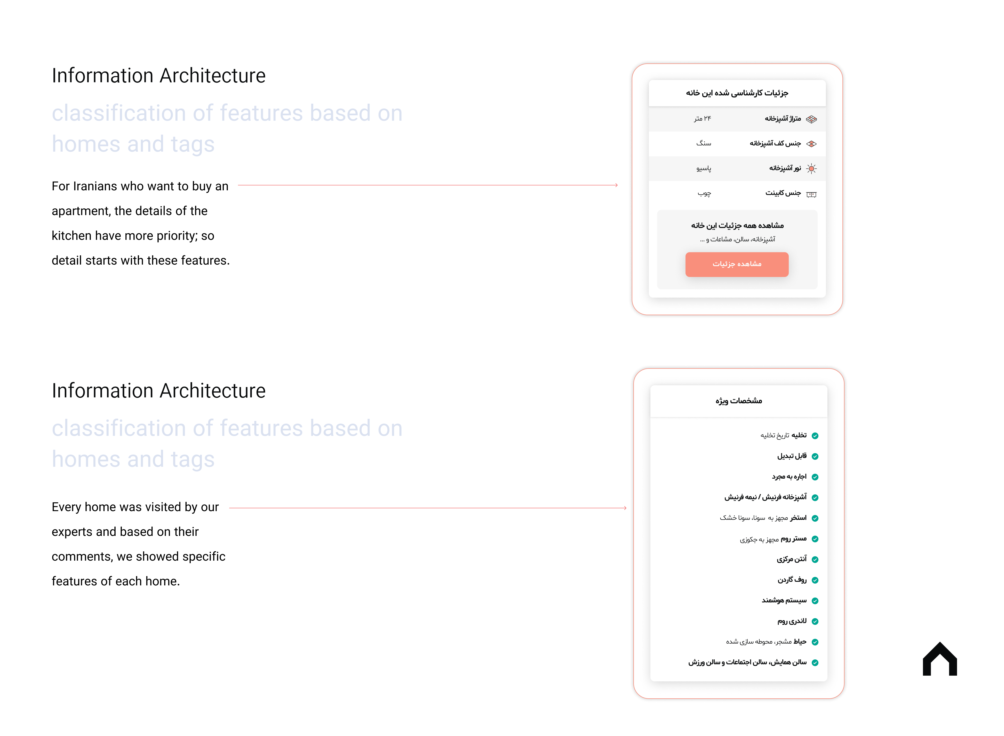
4: hierarchy of Information: We should change the data's hierarchy, For example when users want to buy an apartment the kitchen and Exterior design information are important. besides, our product had a competitive feature which was plan, so we put it at the top of the page.

1: Photos
2: Pelan
3: Key INFO (Price, location, bed, Built in, Parking, Elevator)

1: Home & Building details
2: Specific description for rent homes. (Available for singels).
3: Kitchen and building details for buyers.
4: Similar Homes (rent and buy)
5: Neighborhood Information (rent)

We divided CTAs into 2 groups:
1: Main Actions: Call & Book a visit
2: Secondary actions: Share & Like
Explore
Removing extra information: in our listings we used to show lots of information of apartments which But I decided to show the main features and encourage users to go into more detail.
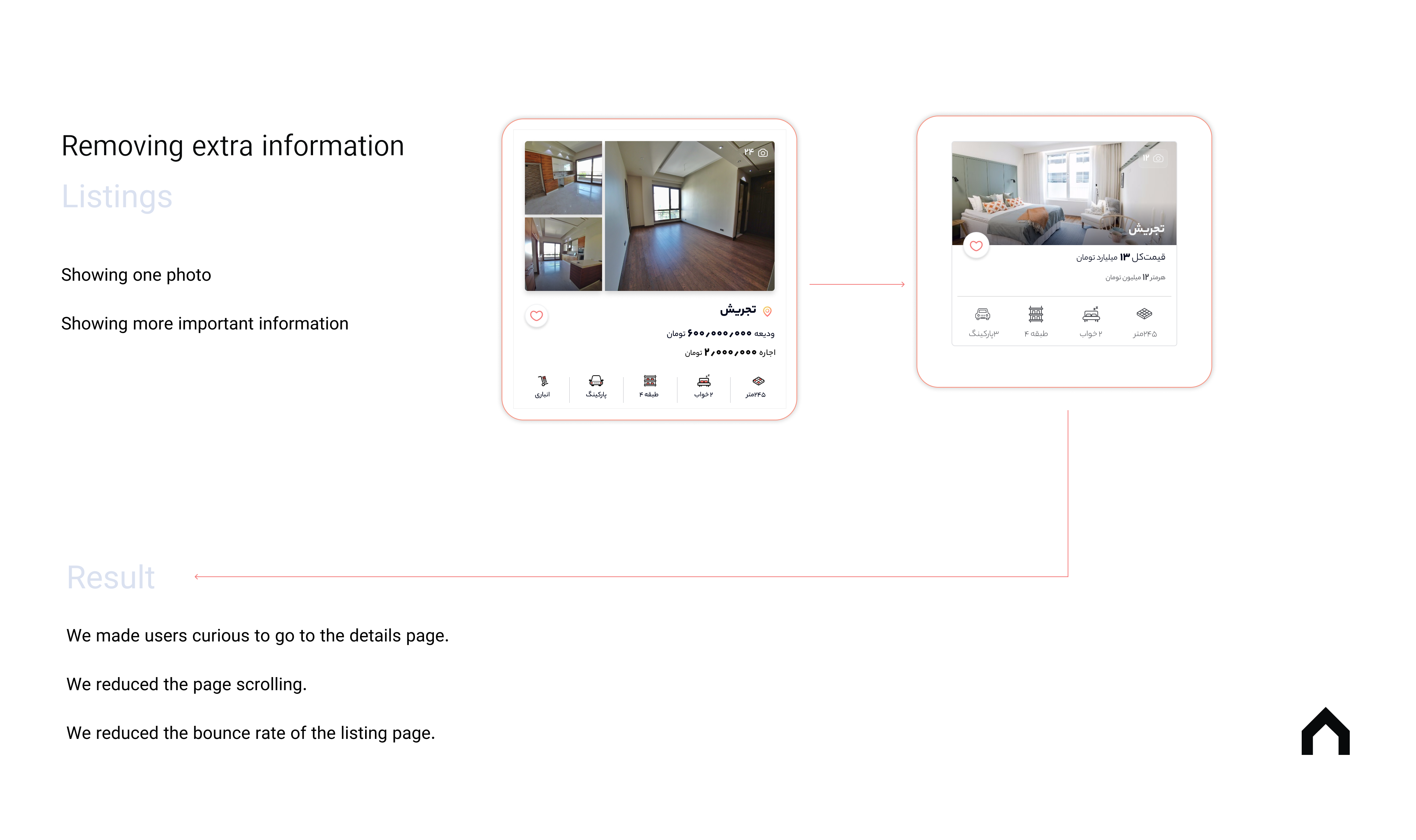

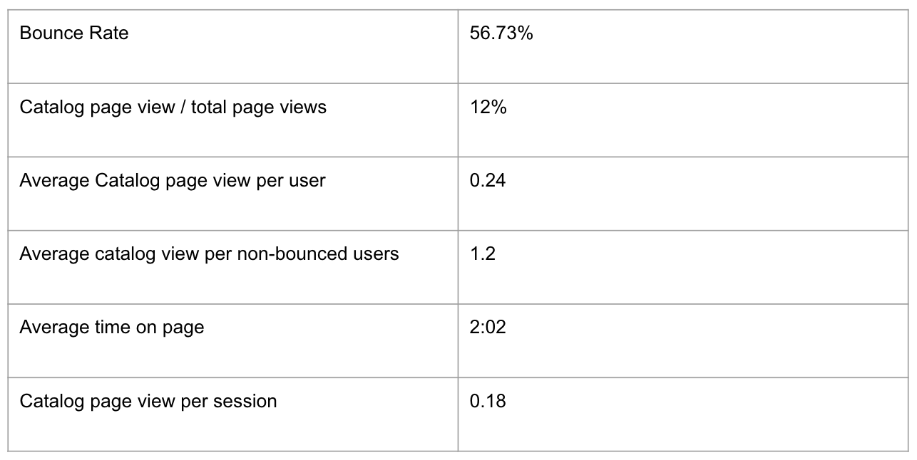
Increasing time on page

Increasing Book a visit conversion

increasing call conversion
If you like what you see and want to work together, get in touch!
Zohreasgari0@gmail.com