Designing Asan Bime Website

Insurance Project
Project Overview
The online insurance industry in Iran is indeed new and Asan Insurance has become one of the most important platforms for selling insurance online with one year of activity in this field. Therefore, according to our latest survey, insurers and customers are 97% satisfied with easy use of insurance. We can categorize insurance services in Iran into Vehicle insurance, which is a significant player, health insurance, Property insurance, and
Physicians' Liability insurance. The project is a PWA Version provided on a super application named Asan Pardakht, with 40+ installation.
My Role
When I joined Netap as a head of product design team, one of projects which was assigned me was Asan Bime. The first step was improving the experience of the current PWA version and the second step was redesigning it.

Research Methods
Call center feedback
Heuristic review
Guerrilla Testing
Survey
Purpose
The purpose of this study was to find out how our target group buy insurance services. Why where and how does buying insurance fit into their daily lives?
We needed to get an understanding of this so that we know what new features would be most relevant and helpful to our target group.

Method
We did 8-10 contextual interviews with people from our target group and had them show us how and why they use and buy insurance.
Additionally, we called some users and asked them about their experience of our product.

Participants
based on  google Analytics, Participants were people aged (25-34, 18- 24, 35-44) who needed an insurance service at least once a year.

Introduction
Hi. As you know my name is Zohreh Asgari and I work on the user experience team in Asan Bime. We are really interested in learning more about the role that insurance plays in people’s life, about which I want to talk with you today.

Interview Guide
Have you ever bought an insurance product?
Have you ever bought an online insurance product?
How do you buy it?
Can you describe the last time you bought an insurance  service?
What was the worst part of this experience?
What element could improve your experience during this activity?

Data and Analysis We recorded videos during the interviews using mobile phones.

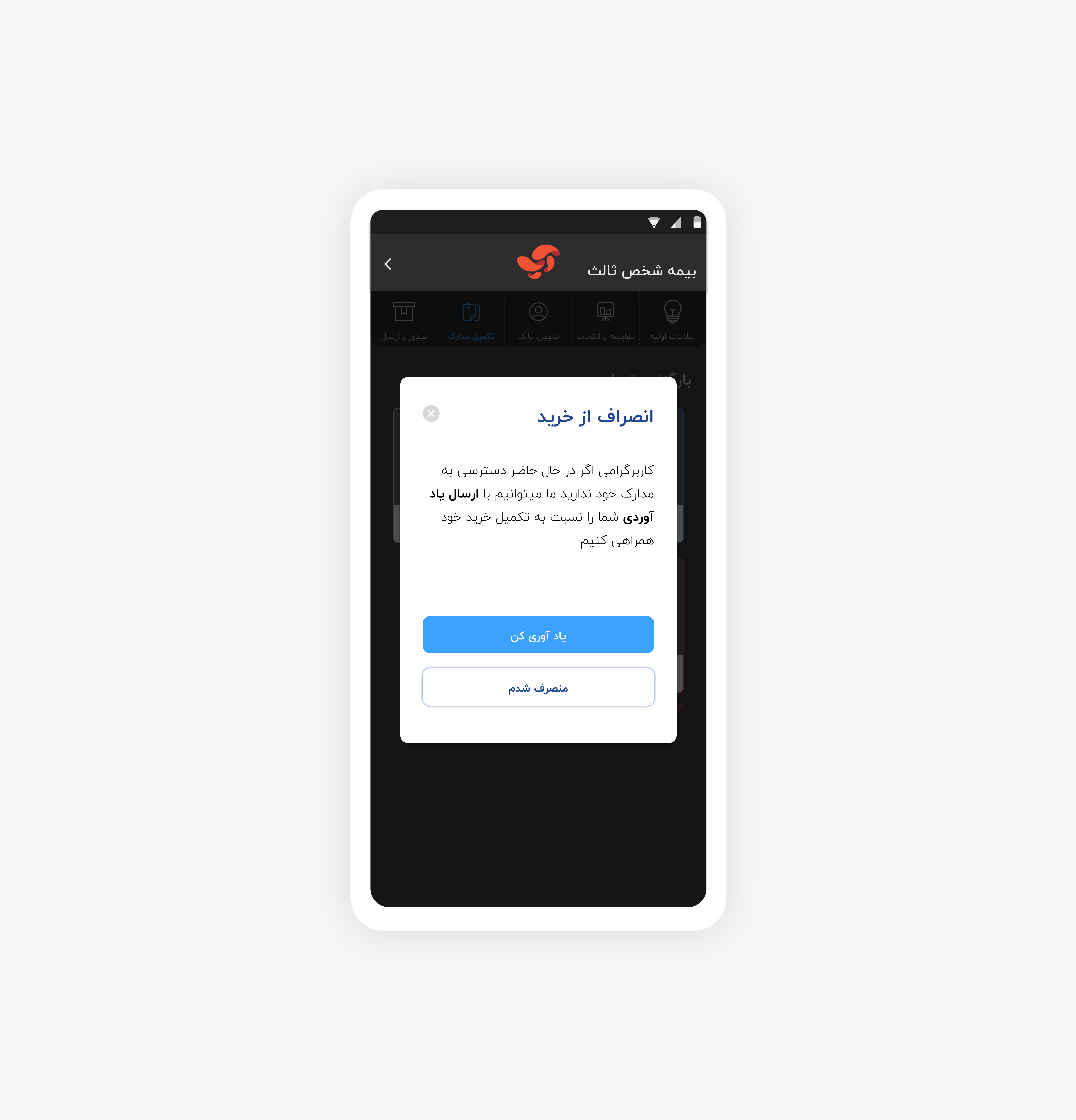
These are some major problems:

  • On Issued Insurance: Users can not download  PDF.
  • After payment, Users need to inquiry their insurance.
  • Users need to read ‘’terms and conditions’’ in the first steps.
  • Health insurance : they need to see available hospital list which provide related services.
  • Car insurance: They need to see branches before buying a service.
  • They embrace online chat.
  • When they buy an insurance service, they need to download and find it easily, However, it is not accessible in the correct design.
  • In some cases price is not comparable.
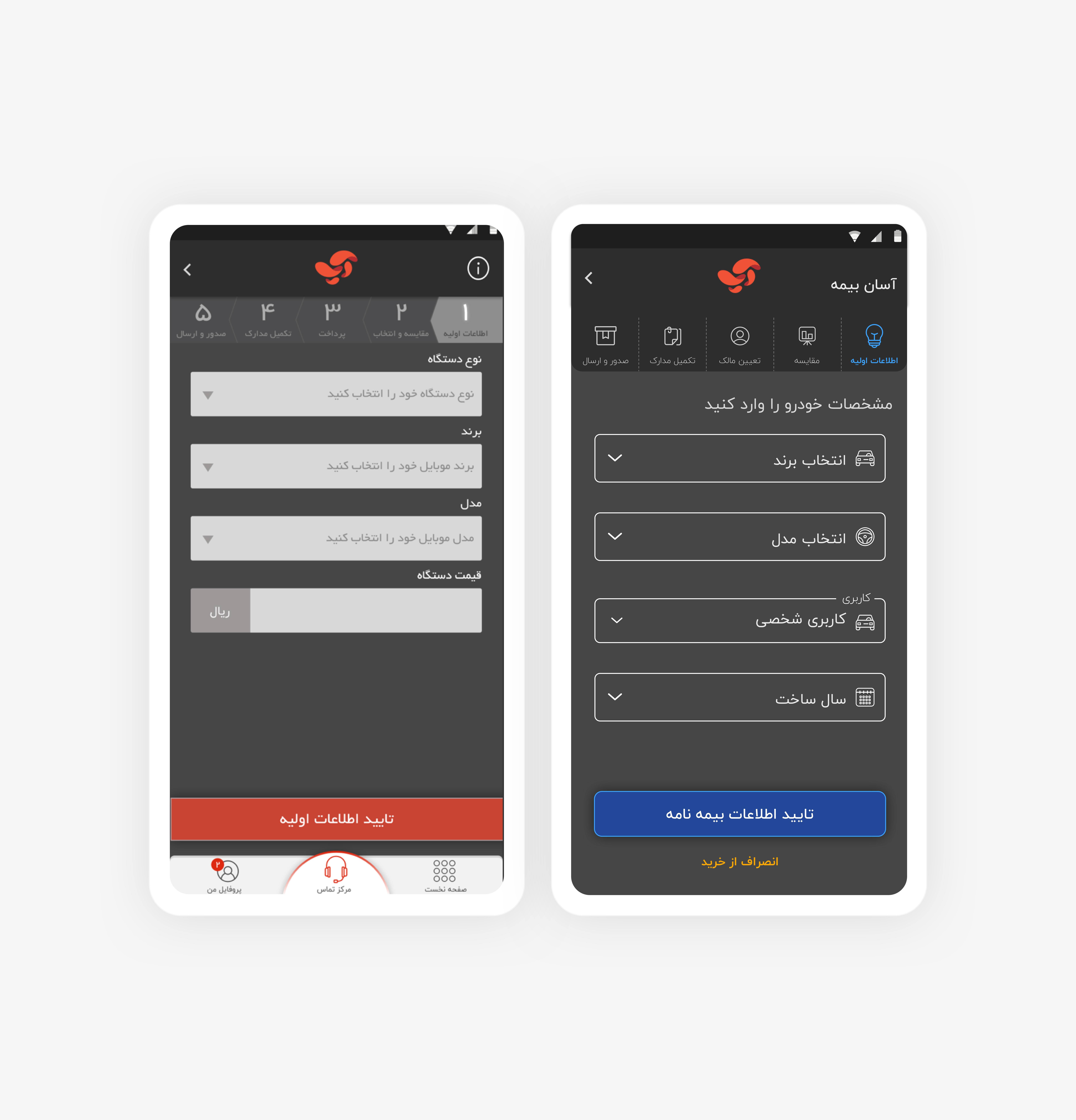
  • Steps progress bar should be click able because users click on it and they want to edit.
  • Some orders take time to be issued, so users need to know how much time will it take.
  • UI improvement should be considered because some inputs are not clickable, colors doesn't convey users.

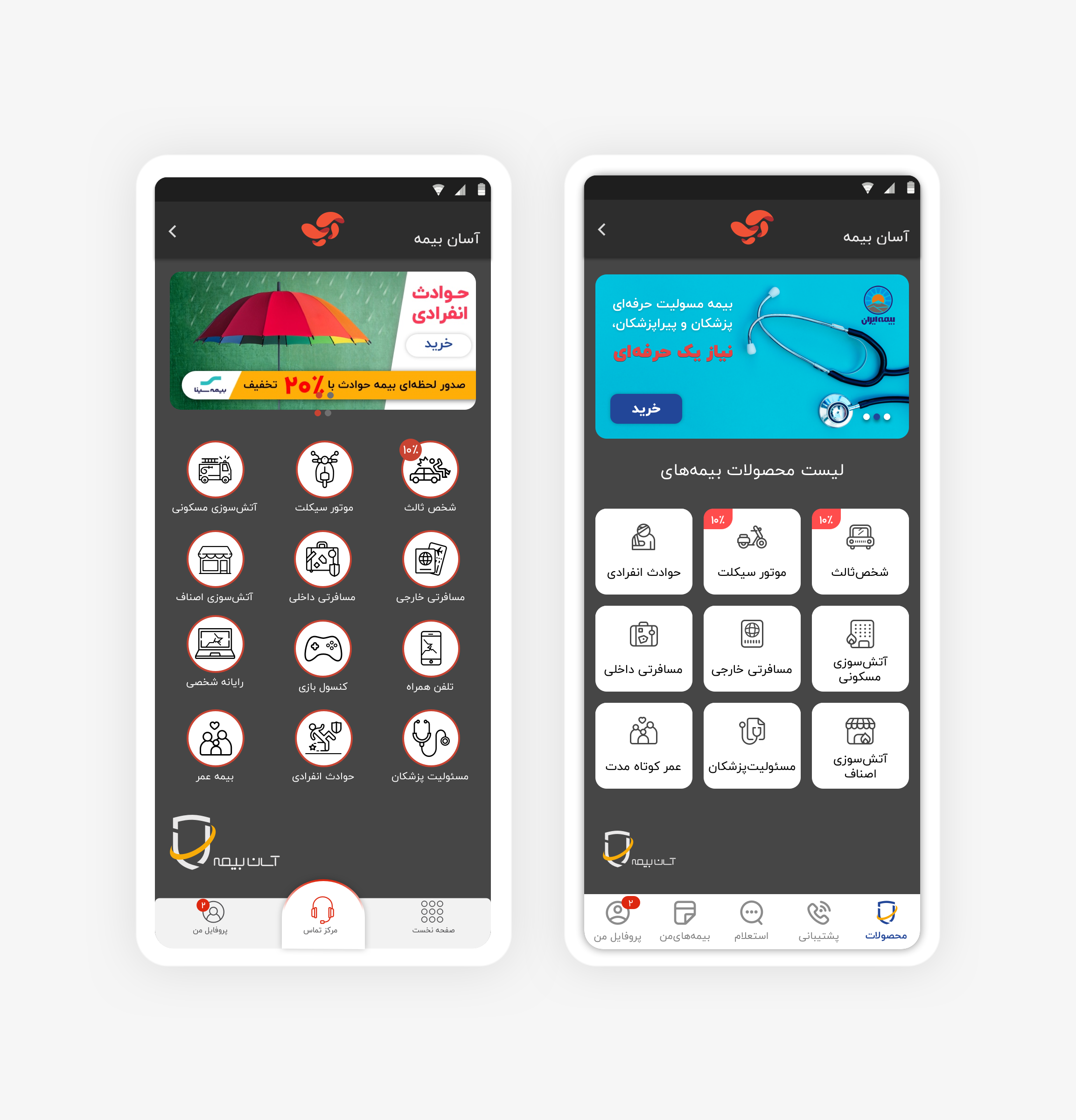
The first step was to fix some major problems in PWA version.

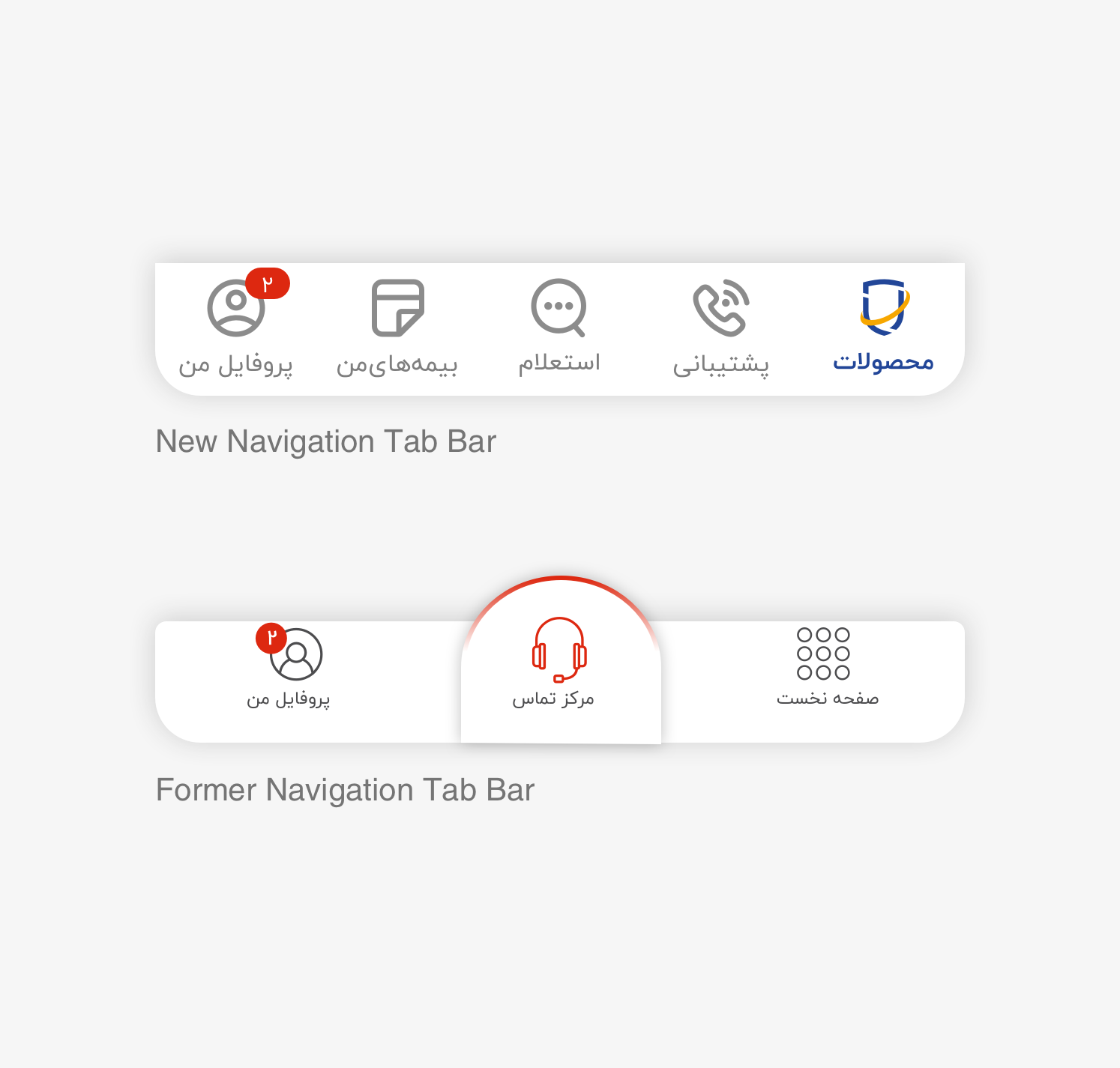
  • Changing navigation bar.
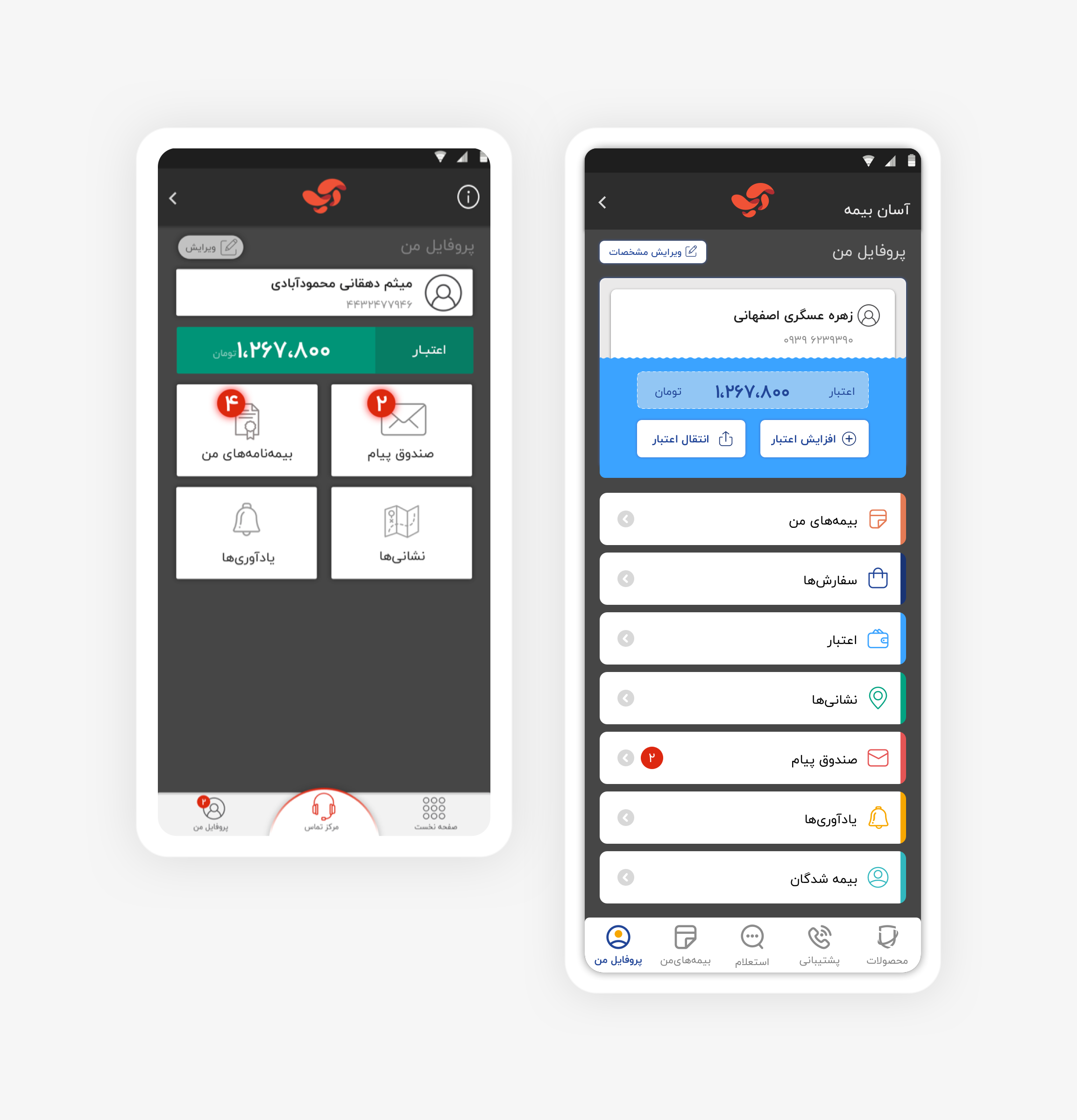
  • Redesigning homepage.
  • Having a consistent and delightful UI.
  • Flow improvement.
  • Also, we changed some microcopies to help users better than before in their journey.

Home page


In this structure slideshows are essentially the highest point in the architecture of the user interface, so, I changed them they are not clickable.

1: Having a minimal Icon set.
2: Hierarchy of service based on click's rate
3: Changing the navigation bar based on product and users' needs.
4: Providing related services in one group (Electronic device's insurance)

Navigation Tab Bar


Navigation is s the ‘steering wheel’ of any site or application, which works like a compass to keep users informed as to where they are at any time.

The former design didn't support all the features, and also the status of the active page was not specified correctly.
Actually, titles, tabs, and navigation bars can be used to support page structure, answering the user’s question of ‘Where am I?’
New Navigation bar is included: Homepage, Support center, and profile.
I changed it to Services, Help, Inquiry, issued insurance, and Profile.

Profile


Credit is the most important feature in the profile tab.
By using visual elements, it has been more considerable. Other features have been sorted based on user feedback.

1: Consistency and standards.
2: Modern and minimal design.
3: Match between system and the real world.
4: Data organization

Flow Improvement


In flows I decided to hide navigation bar, and fix CTAs.

Moreover, I changed the style of inputs to outline because in long forms they are less boring. Based on material design suggestion.

Exit Confirmation


In flows I decided to hide navigation bar, and fix CTAs.

The dialog gives users two options: leave  and continue.
So, they can continue their journey and pick up where they left off without losing their progress.

Mind Map


It was important to consider four factors before developing a basic network data visualization:
The positions of nodes, the use of edges, the dimensions to be used and any interactions to be contained within the visualization.So, our ideas were shared and organized through a Mind

View Mind Map

Flow Map

How did we design for user flow?
User’s objectives User wants to buy a new insurance.
User wants to see the insurance after being issued.
By mapping out all the possible objectives and comparing them to business objectives – it becomes easy to create user flows.

View Flow map

Wireframes

Good Wireframes are Skeletons for Powerful Prototypes & Delightful Designs.
We drew overviews of interactive products to establish the structure and flow of possible design solutionsIn high-fidelity wire-framing, we introduced more realism, including pictures and perhaps even some interactivity.

View Wireframes

Want to work together?

If you like what you see and want to work together, get in touch!